From reed to typeface — Arabic type design today
Every Arabic font is a negotiation between the calligrapher's hand and the machine's constraints. Early Arabic printing flattened the script — metal type could not join letters the way a reed does, and centuries of contextual richness were squeezed into a few hundred fixed sorts, each form of each letter a separate piece chosen by the compositor's hand. Digital OpenType moved that choice into the font itself: initial, medial and final forms, ligatures and alternates are now picked by context as you type, so a font can behave almost like a hand. Today's Arabic type scene is busy — foundries across the region draw faces that honour Naskh or Kufic structure while working at interface sizes no reed ever considered. The studio you are in stands on that work: every style here is a font whose designer solved, letter by letter, how a living script survives the grid.
The first Arabic books from Italy
The first Arabic letters in a printed book were cut in wood: an alphabet in Bernhard von Breydenbach's pilgrimage book, printed at Mainz by Erhard Reuwich in 1486. Movable Arabic type arrived in 1514 with the Kitab Salat al-Sawa'i, a Book of Hours for Arabic-speaking Christians, generally given to the Venetian printer Gregorio de Gregorii. Its place is disputed: the book names Fano, and some historians accept this, while the bibliographer Miroslav Krek argued for Venice.
In 1537–38 the Venetian printer Paganino Paganini and his son Alessandro produced what is thought to be the first printed Qur'an in Arabic, most likely meant for sale in the Ottoman Empire. It did not sell; the one known copy was found in 1987 in a monastery library on San Michele in Venice. Both books show the core difficulty. Latin type is a set of separate letters; Arabic is a joined line whose letters change with their neighbours, so European presses broke it into fixed pieces of metal, a separate sort for each form a letter can take.
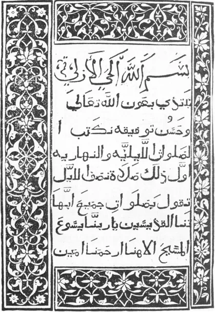
12 September 1514 (imprint: Fano) · British Library, London
Photo: Wikimedia Commons, public domain
Rome: the Medici press and Granjon's punches
In Rome, Cardinal Ferdinando de' Medici founded the Typographia Medicea in 1584, with Giovanni Battista Raimondi as its manager. Working until 1614 under a papal privilege for books in 'foreign languages', it printed Christian texts for the East and Arabic science for European scholars.
Its Arabic was cut by Robert Granjon (about 1513–1590), a Parisian punchcutter known for his italics and Greek, who worked on Arabic in Rome in 1580–86. A punch is a steel bar with one letter cut in relief on its end; struck into copper it makes a matrix, from which the lead sorts are cast. Many of his punches survive; those for the Medici Gospels were shown by France's Imprimerie nationale in 2013.
The press printed the Gospels in Arabic (1590–91); al-Idrisi's geography and two grammars, Ibn al-Hajib's Kafiya and the Ajurrumiyya (all 1592); Avicenna's Canon of Medicine (1593); and Euclid in the version of Nasir al-Din al-Tusi (1594).
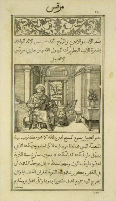
1590–1591 · Printed in Rome, 1590–91
Photo: Wikimedia Commons, public domain
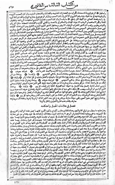
1593 · Wellcome Collection, London
Photo: Wellcome Collection, Wikimedia Commons (Avicenna, Canon; Rome; Typographia Medicea, Wellcome L0018994.jpg), CC BY 4.0 (creativecommons.org/licenses/by/4.0)
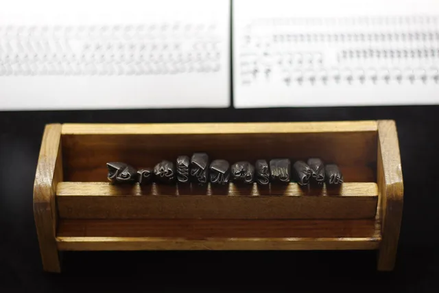
16th century (photographed 2013) · Imprimerie nationale, France (shown at Nancy, 2013)
Photo: ActuaLitté, Wikimedia Commons (Arab type punches Poinçons d'arabe des Quatre Évangiles, gravés par Robert Granjon pour l'imprimerie des Médicis, XVIe (9730996293).jpg), CC BY-SA 2.0 (creativecommons.org/licenses/by-sa/2.0)
Leiden, Istanbul, Cairo
In Leiden, Thomas Erpenius (1584–1624), professor of Arabic from 1613, followed Savary de Brèves, who had paid for an Arabic press in Paris: he ordered a new Arabic fount at heavy cost and printed in his own house. In 1617 his press issued the Ajurrumiyya and the Hundred Governors in Arabic and Latin.
Hebrew type had been used in the Ottoman lands since 1493 or 1504, and Christians printed Arabic at Aleppo in 1706–11. The first Muslim to print with Arabic type was İbrahim Müteferrika, a convert born in Kolozsvár (Cluj). In July 1727 a decree of Ahmed III, backed by a fatwa of the Şeyhülislam, licensed him and Mehmed Said Efendi to open a press in his Istanbul house. Its first book, the Arabic–Turkish dictionary known as Vankulu, appeared early in 1729. In his lifetime it printed seventeen titles in twenty-three volumes, none of them religious. He died in 1745, or early in 1747 by TDV's reading of the pay registers.
In 1815 Muhammad Ali Pasha sent a mission to Milan to study presswork and type-casting. His press at Bulaq, in Cairo, was founded in 1820 and opened in 1821; its first book, an Arabic–Italian dictionary, followed in 1822.
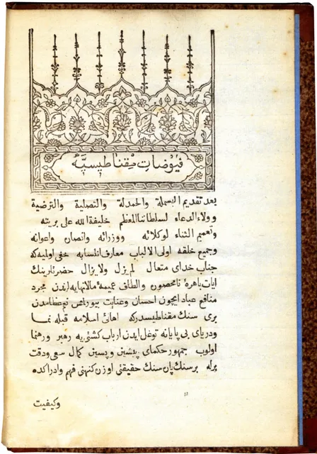
1732 · Austrian National Library, Vienna
Photo: Wikimedia Commons, public domain
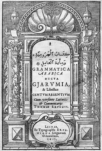
1617 · Printed at Leiden by the Typographia Erpeniana
Photo: Wikimedia Commons, public domain
Lithography: printing the hand itself
Lithography, invented by Alois Senefelder at the end of the eighteenth century, prints from a flat stone. A scribe writes the page by hand, and the stone reproduces that writing, so every join and every stretched letter survives.
A lithographic press reached Tabriz from Tiflis in 1821, ordered by the crown prince 'Abbas Mirza. A press was certainly working in Tabriz by 1248/1832–33; its first books were a Qur'an that year and Majlisi's Zad al-ma'ad in 1251/1836. Iranica gives three reasons for its success in Iran: cheaper equipment than type, many professional copyists, and a strong culture of calligraphy. Hundreds of scribes wrote for the stone, masters among them.
A Khamsa of Nizami lithographed in 1264/1847–48 from the hand of the nasta'liq master 'Ali Asghar Tafrishi shows the stages of the trade in the margins of its colophon page; Iranica places it in Tehran, the picture's record in Tabriz. Iranica concludes that lithography helped the culture of calligraphy in Iran to last longer.
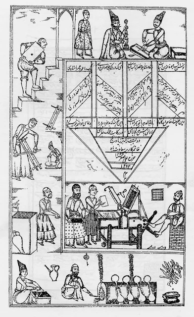
1264 AH (1847–48) · Lithographed at Tabriz (Commons record) or Tehran (Encyclopaedia Iranica); written by 'Ali Asghar Tafrishi, drawings by 'Ali Quli Khu'i
Photo: Wikimedia Commons, public domain
From Bulaq to the screen
In 1905 the Bulaq press, by then the Amiri Press, cut a new naskh for book text that keeps much of the written hand within the limits of metal. It set the Cairo Qur'an of 1924, called the first printed edition accepted by al-Azhar in one Wikipedia article and one of the first in another. In 2011 Khaled Hosny released Amiri, a digital revival of it; this studio's Arabic interface is set in Amiri.
Others tried to shrink the problem. The Lebanese architect Nasri Khattar (1911–1998) drew 'Unified Arabic', in which every letter keeps one shape wherever it stands in the word. Sources differ on the details: 33 shapes or 30; designed in 1932, patented in 1947, launched in 1957. Khattar meant it for print only, and it never caught on.
Digital type took the other road and kept the forms. Unicode stores each letter once, by meaning, and the font picks its shape; OpenType, announced by Microsoft and Adobe in 1996, lets a font swap and place shapes by context. Thomas Milo's DecoType engine builds the naskh line by rule, as a scribe would. To judge an Arabic font, set a word you know beside a good manuscript, and check that the joins sit on the line, the sin keeps its teeth and the dots find their places.
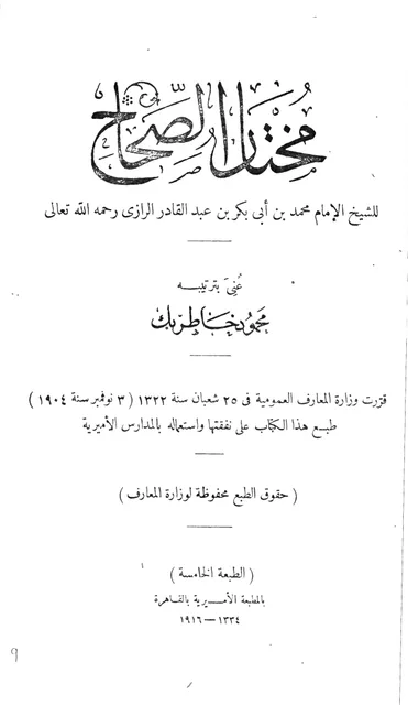
1334 AH (1916) · Amiri Press, Bulaq, Cairo
Photo: Wikimedia Commons, public domain
Sources
- Wikipedia (English), "Kitab Salat as-Sawai", "Paganino Paganini" and "Medici Oriental Press"
- Wikipedia (English), "Robert Granjon" and "Thomas van Erpe"
- Erhan Afyoncu, "İbrâhim Müteferrika", TDV İslâm Ansiklopedisi, vol. 21, 2000
- Wikipedia (English), "Bulaq Press" and "Amiri (typeface)"
- Olimpiada P. Shcheglova, "Lithography i. In Persia", Encyclopaedia Iranica, 2009
- Wikipedia (English), "Nasri Khattar" and "Unified Arabic"
- Wikipedia (English), "OpenType", and "Letters of Light" (on J. R. Osborn, Letters of Light: Arabic Script in Calligraphy, Print, and Digital Design, Harvard University Press, 2017)
- Wikipedia (English), "Erhard Reuwich" and "Ibrahim Muteferrika"
Try it now in this very script — حرفٌ حيّ
Open in the Studio →Written by the MASHQ studio · last updated 2026-10-05. Further reading, the standard references in English: Sheila S. Blair, Islamic Calligraphy (Edinburgh University Press, 2006) · Annemarie Schimmel, Calligraphy and Islamic Culture (New York University Press, 1984) · Yasin Hamid Safadi, Islamic Calligraphy (Thames and Hudson, 1978).
Keep exploring
From the store's journal: Why we choose acrylic: the craft behind MASHQ