What the reed knows — how a nib makes a letterform
Arabic letterforms are not drawn outlines; they are the record of a cut reed moving. The qalam is trimmed to a flat edge held at a nearly constant angle, which differs from script to script — the Naskh pen in the laboratory below, measured from its face, sits at about 59 degrees to the line — and every thickness you see is simply that edge turning against the direction of travel. Where the stroke runs parallel to the nib it thins to nothing; where it crosses the nib squarely it swells to the full width. This is why the same hand produces a hairline in the tail of a ra and a heavy shoulder in a ba: the pen never changed, only the path did. Understanding this reverses how you read a letter. Instead of asking what shape the ink makes, ask where the hand went and how the edge was oriented as it travelled. A skeleton plus a nib angle is enough to reconstruct the whole letter — which is precisely what the laboratory below does. The measurements matter too: classical proportion is counted in nuqta, the rhombic dot the nib itself stamps, so a script's entire geometry scales from the width of the reed that wrote it.
Choosing the reed
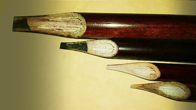
In the Ottoman tradition, as the calligraphy historian Uğur Derman records it, the best reeds grew on the shores of the Caspian Sea and around Wasit on the Tigris, whose reed was famous by name as the qalam Wasiti. A good reed is round and naturally hard, with at least 20 to 25 centimetres between its knots.
A fresh reed is pale yellow and too soft to write with. It was buried in horse manure, whose steady warmth dried and hardened it and turned it brown or almost black. One spotted kind, 'tiger skin', was hard by nature. A buyer tested a reed by dropping it from 8 to 10 centimetres onto a hard floor. A cracked reed buzzed and lay still; a sound one rang and bounced.
In the first half of the nineteenth century, Istanbul calligraphers on pilgrimage saw Javanese pilgrims writing with the 'Java pen', a thin black stick as hard as ebony, set into a reed holder. It kept its edge through long texts, and Çömez Mustafa Vasıf and his pupil Mustafa İzzet adopted it for naskh. For the largest jali, scribes used bamboo or carved wood.
photographed 2016 · Photograph
Photo: Farzan44, Wikimedia Commons (Reed Pens.jpg), CC BY-SA 4.0 (creativecommons.org/licenses/by-sa/4.0)
Cutting the pen
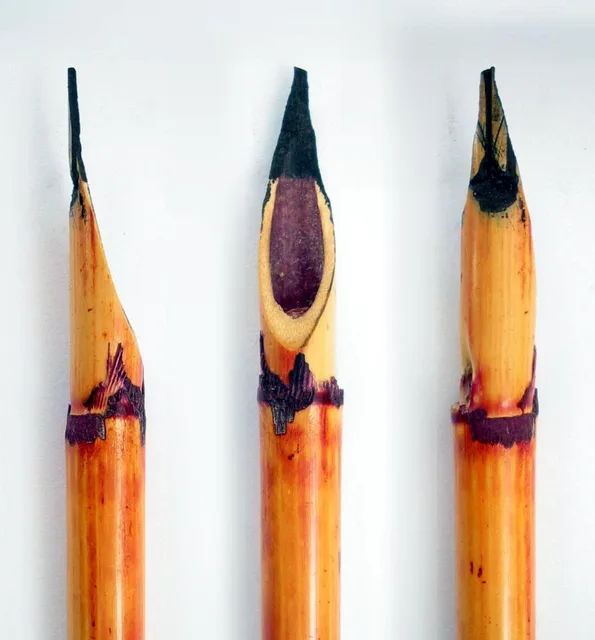
Cutting the pen follows a fixed order. The knot is cut away a finger's width from the end, or the slit runs crooked. The reed lies in the left palm and is cut on a slope until the opening looks like an almond. The point is thinned into a flat blade, and both sides are trimmed equally to the nib width you want. A long blade writes fast; a short one writes slowly.
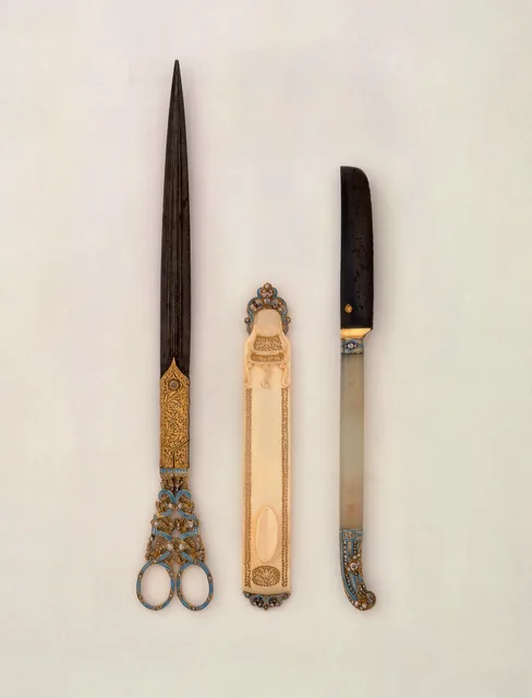
Next comes the slit, the shaqq, a straight split down the nib that holds ink and feeds it steadily. The two halves have names. The one toward the writer is the insi, the other the wahshi, and the wahshi is left a little wider. Last comes the qatt, the cut across the tip, made with the reed resting in the groove of the makta. It is cut on a slant so that the wahshi side stays longer, and a crisp crack tells you it is done.
A fresh cut writes sharp letters. As the nib wears, the edges roughen, and the pen must be cut again. In long work that is a risk: if the new width differs even slightly, it shows in fine scripts like naskh.
about 1850 · Khalili Collections, London
Photo: Khalili Collections, Wikimedia Commons (Khalili Collection Islamic Art sci 0264.jpg), CC BY-SA 3.0 IGO
photographed 2006 · Photograph
Photo: Baba66, Wikimedia Commons (Qalam2.jpg), CC BY 2.5 (creativecommons.org/licenses/by/2.5)
The slant of the cut
The Ottoman teachers said that a straight cut gives firm letters, a strongly slanted cut gives weak but sweet ones, and the middle is best. The sources say that writing with an obliquely cut pen began with Yaqut al-Musta'simi. Each script has its own degree: ta'liq is cut less obliquely than thuluth, naskh less again, and ruq'a almost straight.
The slant also sets the way the pen sits in the hand. Held so that the whole cut edge lies flat on the paper, which Ottoman calligraphers called the pen's prostration, the reed leans naturally toward the writer. In thuluth and naskh the letter is made without lifting that edge from the page. In ta'liq the finest strokes are made with only half the nib touching.
A portrait made at the court of Mehmed II around 1479–81 shows a young scribe with a pad on his knee and the pen held lightly in his fingertips. The Gardner Museum in Boston gives it to Gentile Bellini; some scholars name Costanzo da Ferrara.
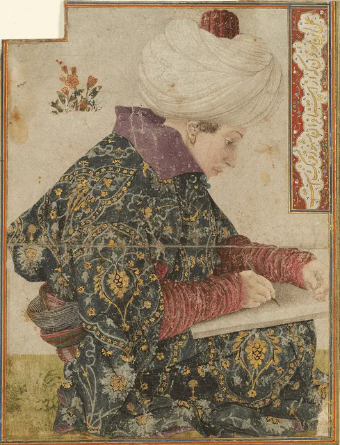
about 1479–81 · Isabella Stewart Gardner Museum, Boston (attributed to Gentile Bellini)
Photo: Wikimedia Commons, public domain
Soot ink
The black ink of the manuscripts is soot ink, still glossy in the oldest books. The soot came from burning linseed oil, beeswax and similar fuels. The Süleymaniye Mosque in Istanbul still has a room where smoke from its oil lamps was gathered, though lamp soot made only common ink. The binder is gum arabic, the best of it from Sudan.
Soot and gum, usually one part to four, are pounded in a stone mortar, with water added as the paste thickens. The old masters asked for 80,000 blows. The calligrapher and ink-maker Necmeddin Okyay counted the strokes of a hired porter and arrived at about 500,000. Ink-makers asked what you meant to write: thuluth, ta'liq and naskh each wanted a different thickness.
Soot ink does not fade, but it sits on the surface of sized paper and can be wiped off, even licked off. That made corrections possible, and it gave Turkish the phrase 'he has licked ink' for an educated man.
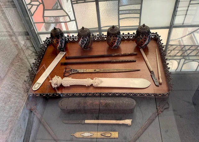
late 19th century · Museum of Turkish and Islamic Arts, Istanbul
Photo: Civic Responsibility project, Wikimedia Commons (Writing Set.jpg), CC BY-SA 4.0 (creativecommons.org/licenses/by-sa/4.0)
Pen boxes, and respect for the reed
Pens were kept in long boxes, about 30 to 40 centimetres, with a place for one or two inkwells, or in the divit, a tube with an inkwell that hung from the belt. In Iran the qalamdan was often made of painted and lacquered papier-mâché; one in the Metropolitan Museum, the work of Muhammad Sadiq, is dated probably 1793–94.
A worn-out reed was not thrown away. Custom said to bury it where no one would walk, with the shavings of each cutting. Many calligraphers kept a lifetime's shavings to heat the water for washing their body after death. Steel nibs spread in Ottoman lands from the 1840s, but calligraphers kept the reed, which follows the hand better.
The old masters' advice to a learner is practical. Hold the pen lightly. After writing, wipe the nib, or the gum will dry in the slit and stop the flow. Grey writing means the ink is too thin; rough letters mean the nib needs cutting again. And listen at the last cut on the makta: the clean crack is your sign.
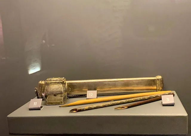
18th–19th century · Museum of Turkish and Islamic Arts, Istanbul
Photo: Civic Responsibility project, Wikimedia Commons (Silver Ornamental Calligraphy Set.jpg), CC BY-SA 4.0 (creativecommons.org/licenses/by-sa/4.0)
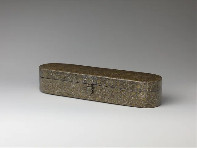
late 13th–early 14th century · Metropolitan Museum of Art, New York
Photo: Wikimedia Commons, CC0
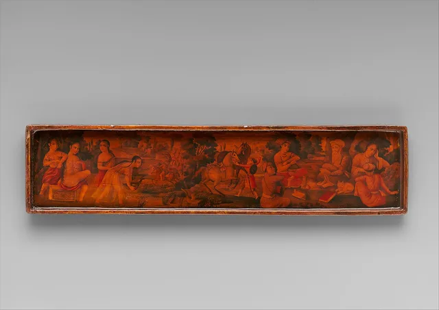
probably 1793–94 · Metropolitan Museum of Art, New York (2014.257)
Photo: Wikimedia Commons, CC0
Sources
- M. Uğur Derman, "Kalem", TDV İslâm Ansiklopedisi, vol. 24, 2001
- M. Uğur Derman, "Mürekkep", TDV İslâm Ansiklopedisi, vol. 32, 2006
- Isabella Stewart Gardner Museum, Boston, collection record "Seated Scribe"
- Metropolitan Museum of Art, New York, collection record "Lacquer Pen Box", 2014.257
- Walters Art Museum, Baltimore, collection record "Pen Box and Inkwell" (Ottoman divit with the tughra of Ahmed III), 18th century
That is the real laboratory above, not a picture — drag the red points and the letter rewrites itself from the nib's geometry. Open it full-size →
Try it now in this very script — قصبة
Open in the Studio →Written by the MASHQ studio · last updated 2026-10-05. Further reading, the standard references in English: Sheila S. Blair, Islamic Calligraphy (Edinburgh University Press, 2006) · Annemarie Schimmel, Calligraphy and Islamic Culture (New York University Press, 1984) · Yasin Hamid Safadi, Islamic Calligraphy (Thames and Hudson, 1978).
Keep exploring
From the store's journal: Why we choose acrylic: the craft behind MASHQ